The New Face of Cigniti – The Nexus Between Our Today & Tomorrow
Our new brand identity and the story behind it
Cigniti, with a rock-solid foundation and people-centric values at its core, has seen a rewarding growth curve over the last 10+ years. As an embodiment that empowers continuous change for global organizations, it is the right time to reflect that transformation inside-out, matching our outside-in perspectives. At this critical juncture in our growth journey, I’m excited to unveil the new face of Cigniti in front of all of you with simplicity at its core. Power of Simplicity is the true testament to the clarity of thought as they say.
This new look is a well-thought manifestation of our unwavering drive for innovation, excellence, and growth. Cigniti is making a monumental pivot from being a pure-play Software Testing and Quality Engineering services only company to a full cycle Digital Assurance and Digital Engineering services company. With this move, at Cigniti, the worldwide leader in AI and IP-Led Digital Assurance services, we are firming up our manifestation to evolve as a focused Digital Engineering services company as well without compromising on our foundational principle of being a Quality-First company, which will always continue to be in every facet of our business. Having immense pride for our recognition as a global leader in independent pure play software testing services, our quality-first pedigree is imbibed deep within our DNA.
Our Digital thinking and our Digital avatar reflect our ability to Engineer, Assure, and thereby technologically Transform & accelerate outcomes for our clients, helping them achieve market leadership in their chosen lines of business.
60+ Fortune 500 companies, 70 of Global 2000 companies, and 200+ active clients across 23 countries are a testament of our credentials and we aspire to increase this manifold with this new brand identity of us.
Going into the specifics – Why & What
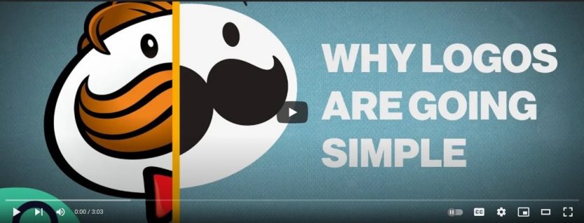
Bloomberg Opinion’s advertising and brands columnist, Ben Schott, explains the importance of shrinking an entire identity of a brand into a tiny little box as mobile-first design gets main preference, while at the same time highlighting the power of ‘debranding’ to professionalize in this video ‘Why Companies are Debranding’.
Our refreshed look is an elegant expression of our core values and customer-centric approach that we bring in each of our engagement.
A few highlights of this changed look are:
- Letting go the tick mark: The iconic Cigniti tick mark was a beautiful representation of our quality-first mindset, indicating our expertise in releasing high-quality software. To embrace the diversification of our offerings, expansion of our service portfolio, and increase in our delivery capabilities, the Cigniti tick mark has been let go of as we believe the quality-first mindset is deeply etched in our DNA forever and does not have to be necessarily, explicitly called out. We in fact stand for Quality.
- No tagline: Software Quality | Assured – an apt expression of what we brought to the table. Our new logo is free of any tagline as we march toward empowering overall digital transformation, rather than only software quality for our customers. Our Digital thinking and Digital manifesto backed by our vision help us promise and deliver value to our customers.
- Spectrum of colors: The basic blue, orange, and white have been complemented with a striking array of colors to showcase the vivacious, high-growth journey that we are on.
- Respecting the diversity: Cigniti is a strong family of close to 4000 people across the world. We believe in the beautiful unison of our diverse workforce that would be enabling this onward journey. We are celebrating our collective and collaborative uniqueness by symbolizing it on the employee ID cards as well.
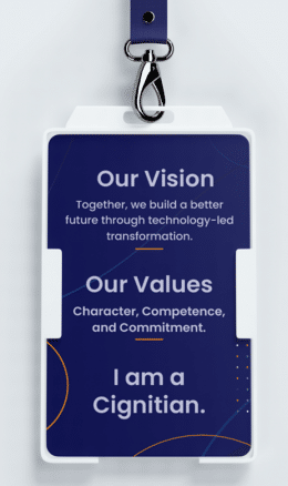 The multi-colored patterned dots on the right bottom corner symbolize:
(a) Indigo: Integrity and Intuition.
(b) Bright orange/neon orange: Enthusiasm, Adventurous, and Creativity.
(c) White: Purity and Transparency.
(d) Emerald green: Reassurance, Restorative and Abundance/Prosperity.
(e) Peach: Vitality, Energy, Playfulness, and Encouragement.
(f) Lavender: Purity, Devotion, Serenity, and Grace/Calmness. - Design & Font: The curve in the Cigniti logo, along with the font size & style is a pure reflection of our agility, versatility, freshness, confidence, & adaptiveness.
- (a) Font Style: Poppins font, Medium weight
- (b) Design: Curve
Our Vision
With the same core, we are leaping ahead to lead the league in Digital Assurance & Digital Engineering services to help further digital ambitions for our global customers. Our endeavor now is to empower purposeful Digital Transformation with the same agility, nimbleness, and flexibility, for which our customers choose us over & over again.As we embark on the next phase in our journey, our collective vision is
Together, we build a better future through technology-led transformation
All of us at Cigniti are excited to be on this journey to Lead the League. There is a lot more to come as we bolster our endeavor to fuel your ambitions.
It is time to go beyond what Cigniti has been.
Stay tuned, the best is yet to be!




Leave a Reply