10 Types of Data Visualizations for Informed Decision-Making
In the world of data-driven decision-making, effective visualization is a cornerstone for translating complex data into actionable insights. Data visualization is a technique that makes information visually appealing by highlighting patterns and trends in the data and enabling readers to get new insights quickly. Different ways of visualization help the leadership team in their day-to-day decision-making. The following explores 10 essential types of data visualizations, each meticulously designed to enhance understanding and facilitate informed decision-making.
Below Are 10 Different Types of Data Visualization Charts
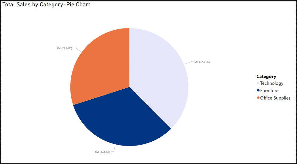
1. Pie Charts
Pie charts are circular statistical graphics divided into slices to illustrate numerical proportions. Each slice represents a percentage or proportion of the whole. They provide a quick and intuitive way to show how a total is divided into components. Pie charts are helpful when you want to emphasize the relative size of individual categories in relation to the entire dataset.
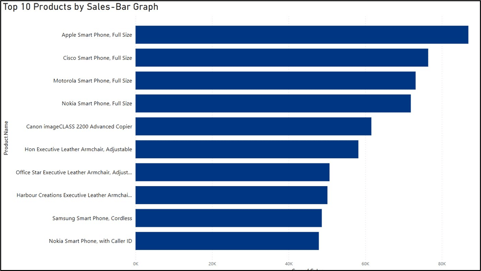
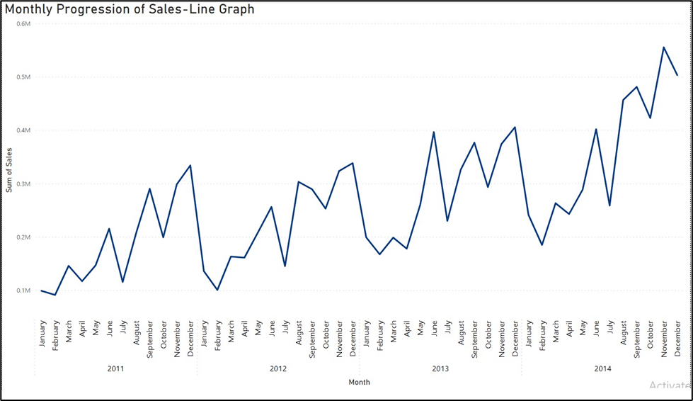
2. Bar Graphs and Line Graphs
Bar graphs use rectangular bars to represent data, often for categorical variables. Line graphs, on the other hand, connect data points with straight lines to show trends over a continuous variable, typically time. Bar graphs effectively compare discrete categories, while line graphs illustrate trends and patterns over time. Together, they offer a comprehensive view of both categorical and temporal data.
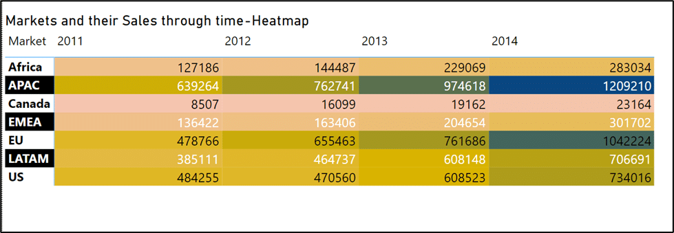
3. Heat Maps
Heat maps use colors to represent data values in a matrix, with each cell having a color intensity corresponding to its value. They are often used to visualize complex datasets, where colors indicate the magnitude of values. Heat maps are excellent for identifying patterns, correlations, and variations within large datasets. They provide a visual summary of complex information, making it easier to interpret.
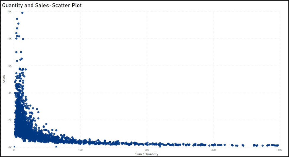
4. Scatter Plots
Scatter plots use individual data points to represent values for two variables, with one variable on the X-axis and the other on the Y-axis. The pattern of points reveals relationships between the variables. Scatter plots are great for visualizing the correlation between two continuous variables. They help identify trends, clusters, and outliers, making them valuable for understanding relationships in the data.
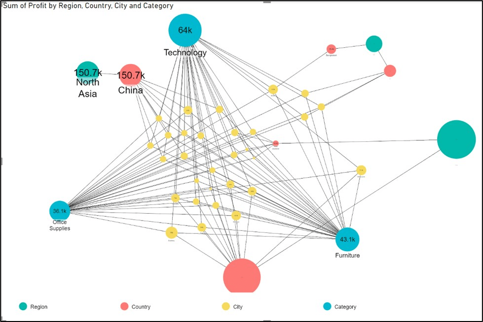
5. Network Visualizations
Network visualizations represent relationships between entities in a network structure. Nodes represent entities, and edges represent connections or relationships between them. Ideal for displaying complex relationships in systems, such as social networks, organizational structures, or interconnected processes. They offer insights into the structure and connections within the data.
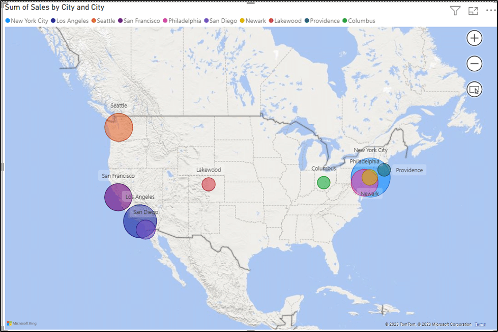
6. Geospatial Data Visualization
Geospatial data visualization maps data onto geographical locations, providing a spatial context. Valuable for analyzing data with a geographical component. It helps understand spatial patterns, trends, and relationships, making it useful in geography, urban planning, and logistics.
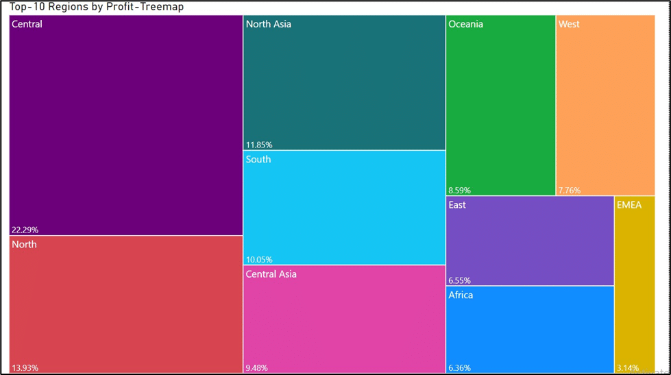
7. Treemaps
Tree maps represent proportional data structures using nested rectangles, with each hierarchy branch represented by a smaller rectangle. Efficiently communicates proportion of a component within the data. Tree maps help visualize and compare data in a compact and organized manner.
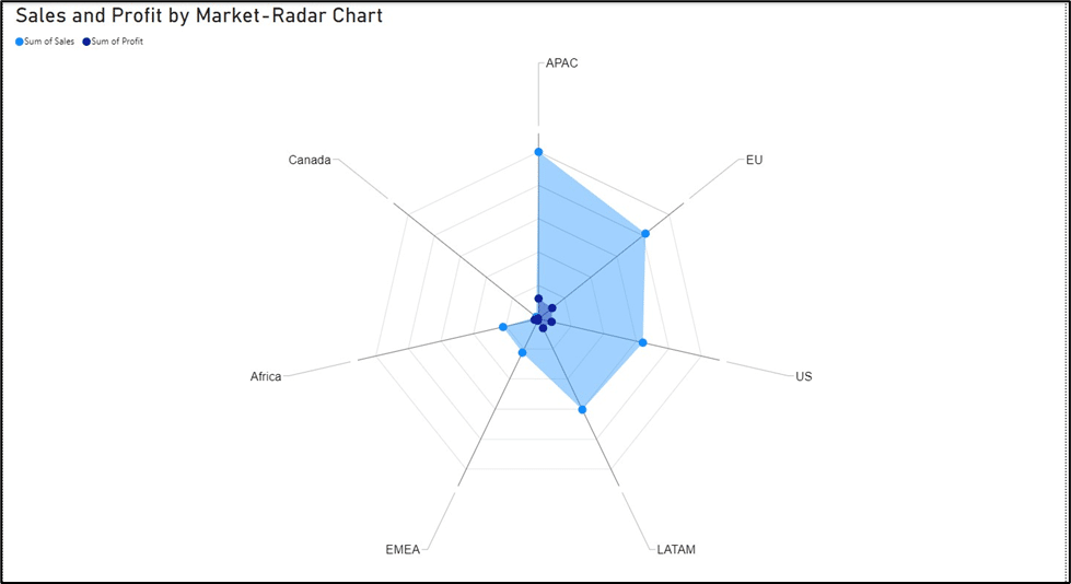
8. Radar Charts
Radar charts, also known as spider charts or star plots, visualize multivariate data on a circular grid with spokes radiating from the center. Ideal for comparing multiple variables simultaneously. Radar charts effectively showcase patterns and strengths across different dimensions, making them suitable for visualizing multidimensional data.
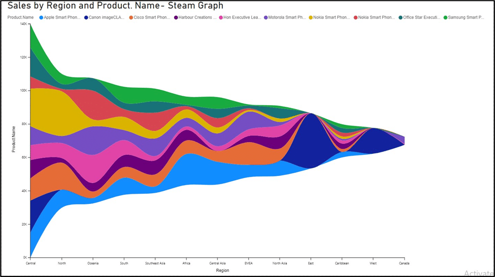
9. Streamgraphs
Streamgraphs dynamically represent changing data trends over time by stacking areas on top of each other. Provide a dynamic view of temporal variations, allowing for the visualization of changing trends and patterns over time. They are engaging and effective in showing the evolution of data over a continuity.
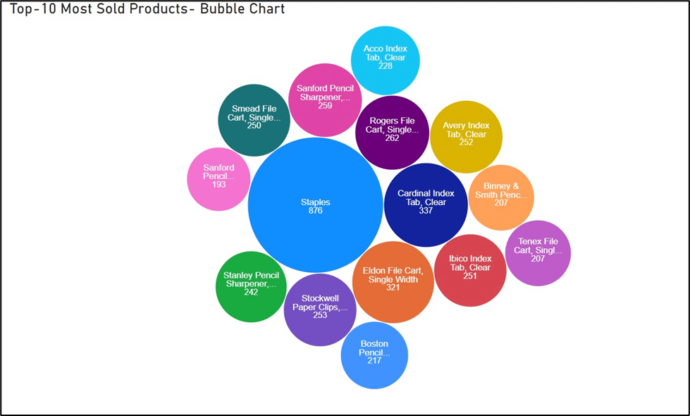
10. Bubble Charts
Bubble charts add a third dimension to scatter plots by representing data points with varying sizes. Bubble charts help visualize three variables simultaneously. The size of each bubble represents a third dimension, allowing for the comparison of multiple dimensions within the data. Bubble charts are effective in conveying the relative magnitude of data points.
Conclusion
These 10 types of data visualizations are indispensable tools for decision-makers. By understanding the strengths and applications of each, organizations can elevate their capacity to derive insights from data, ultimately leading to more informed and strategic decision-making. The key lies in creating visually appealing charts and choosing the right visualization method that best communicates the story within the data.
At Cigniti, we make data visualization an essential component of the reporting process and provide decision-makers with the drill-down and filtering choices they need to swiftly find the answers to their operational problems.
Cigniti is ready to help you with data visualization and value extraction to enhance your decision-making, to know more, visit Cigniti Data Engineering & Insights page.


Leave a Reply